Charla Haasbroek Wines
Charla Bosman is a respected South African winemaker, recognised for her award-winning wines that are deeply layered, well-balanced and elegant (a symbolic reflection of her;).
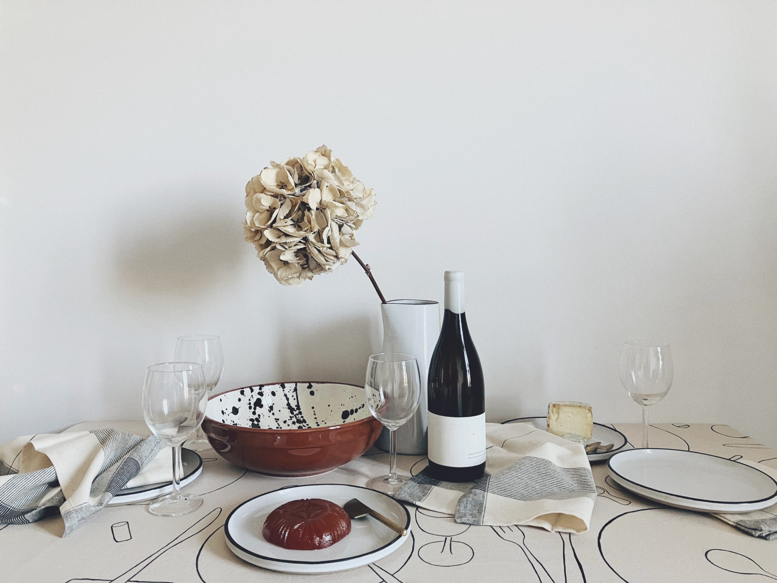
When Charla asked me to design her wine labels, I was immediately inspired by the way she passionately spoke about her wines. Each harvest is a unique opportunity to capture and convey more than meets the eye – or rather palette. Wines made with consideration, intention, patience, care and respect.
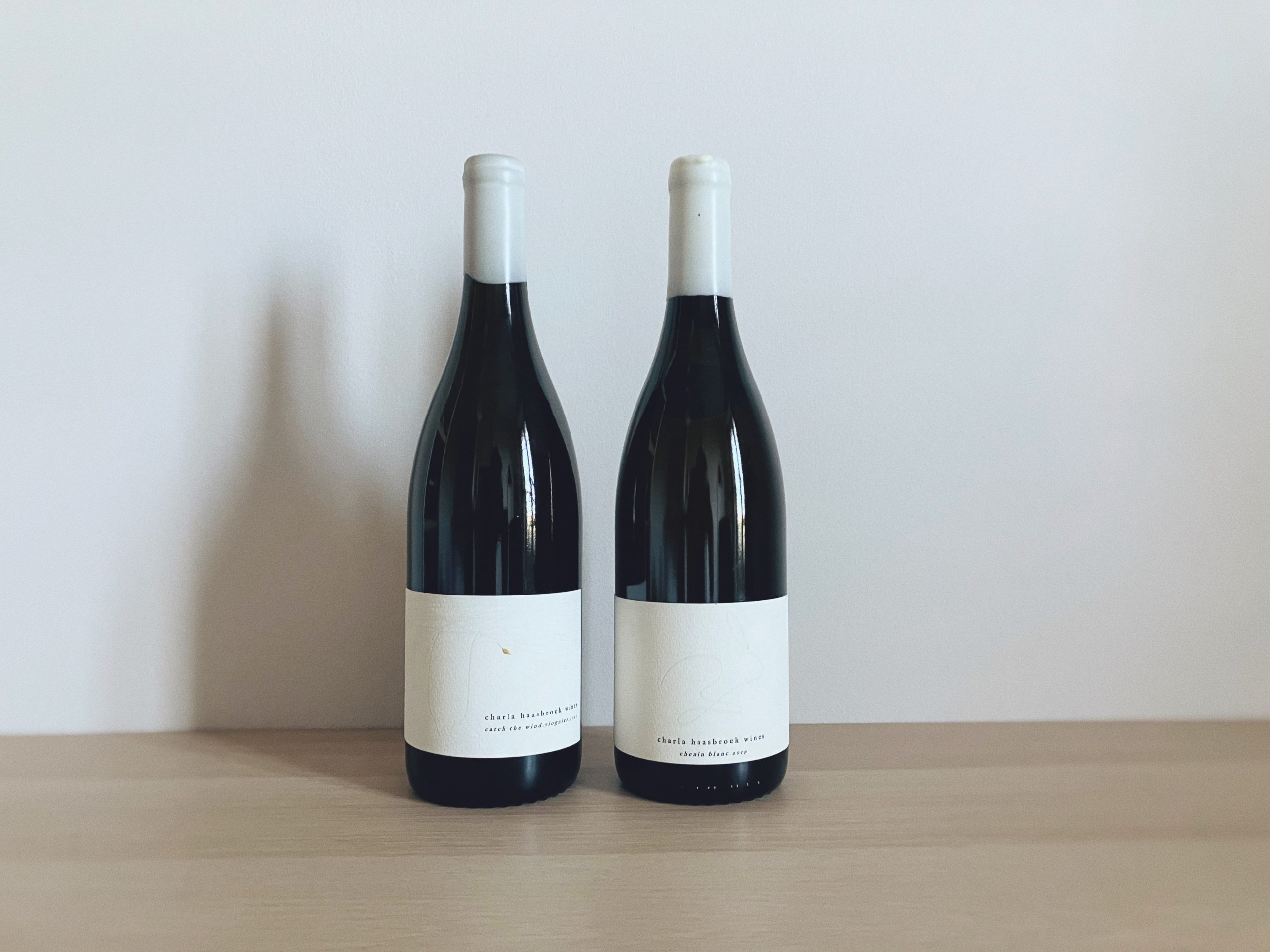
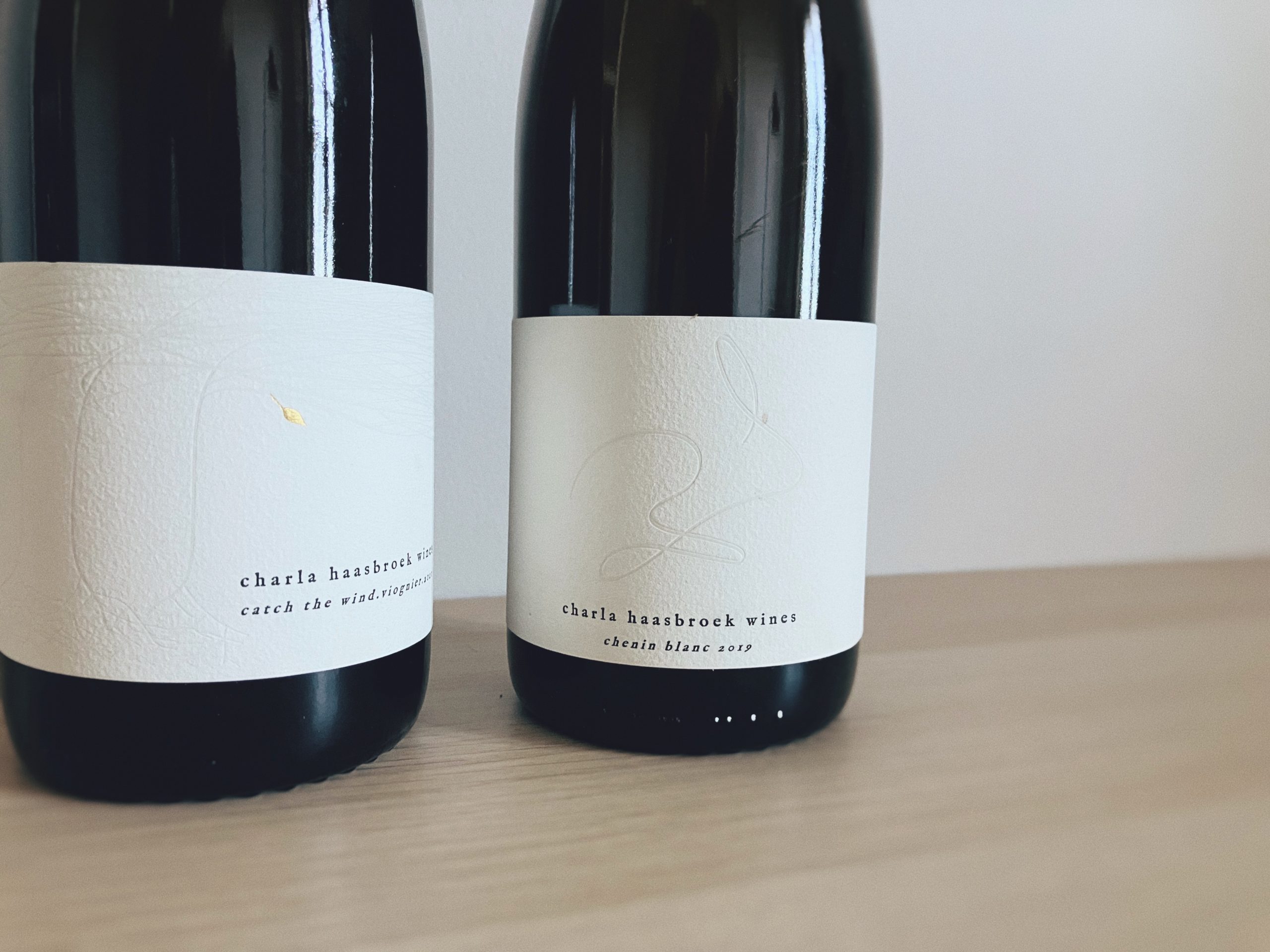
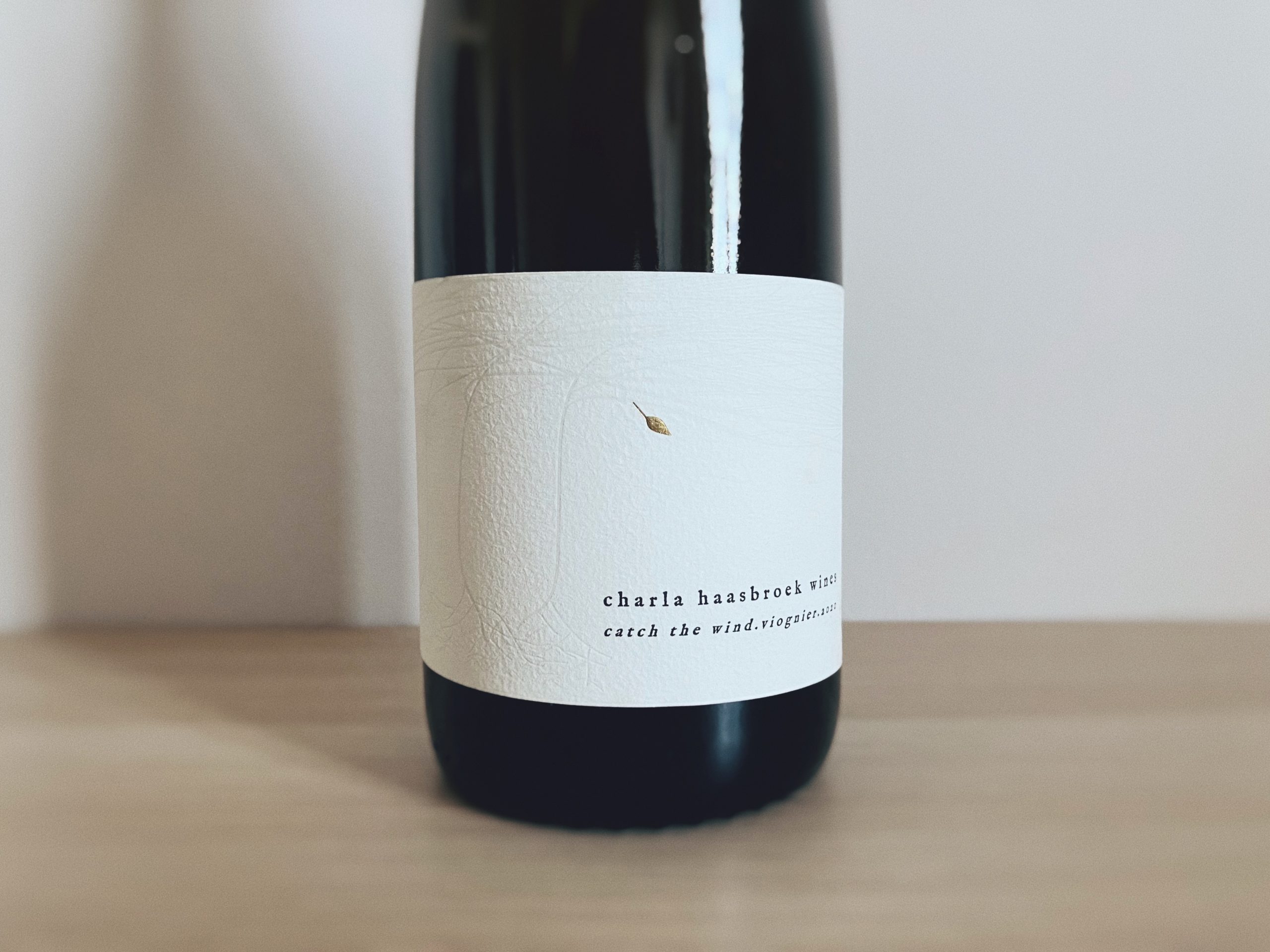
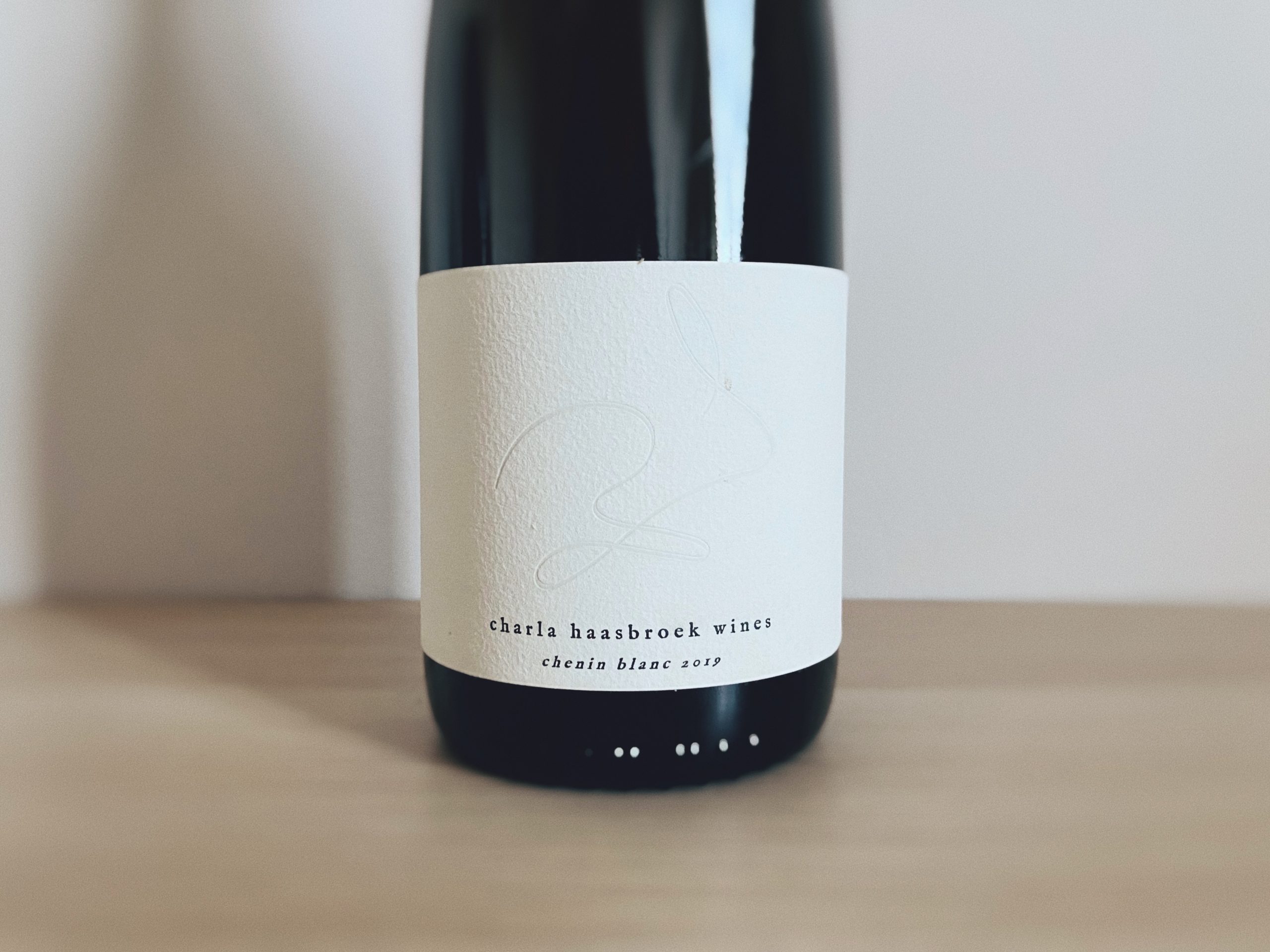
With admiration for her clear vision, adventurous spirit and hands-on approach, it was important for me that the labels capture that, while complimenting her effortless style and timeless character. For Charla, it was important for the labels to be simple; a ‘clean palette’ to allow space for the wine to be interpreted and speak for itself. The deeply-layered character of her wines informed and inspired the choice to emboss (and gold foil) the designs on textured ivory paper. Subtle lines which at closer inspection (and touch) reveal a tactile introduction to what is preserved – and awaiting – inside.